Starting Point
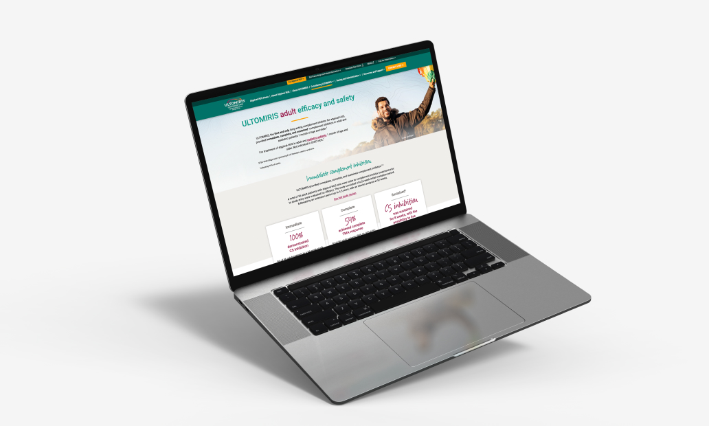
The Existing Experience
The original site had an outdated, cluttered feel that made it difficult to navigate and absorb information. Key content was present, but it competed for attention within a busy layout that lacked clear hierarchy and visual consistency.
The overall design didn't reflect the quality of the information it contained, making the experience feel less intuitive and engaging than it could be.